MapSpot
As a research assistant in the Atlanta Map Room for Assistant Professor Yanni Loukissas, I built MapSpot, the mobile equivalent of the Atlanta and St. Louis Map Rooms. like the Map Rooms, the MapSpot aims to enable grassroots map-making and collaborative and creative explorations of data.
summer 2019 | full-stack web development (HTML, CSS, JavaScript) • interaction design • field research
THE BIG PICTURE
Field Research
Through observation and contextual inquiry, I gathered an understanding of the tool would be used and what changes were necessary
Interaction Design
Redesigned the interface to make data visualization more understandable, conceptualized the relationship between the digital interface and physical map making tools
Full Stack Web Development
(HTML, CSS, JavaScript) After prototyping and designing the MapSpot, I implemented on my designs and developed a web app.
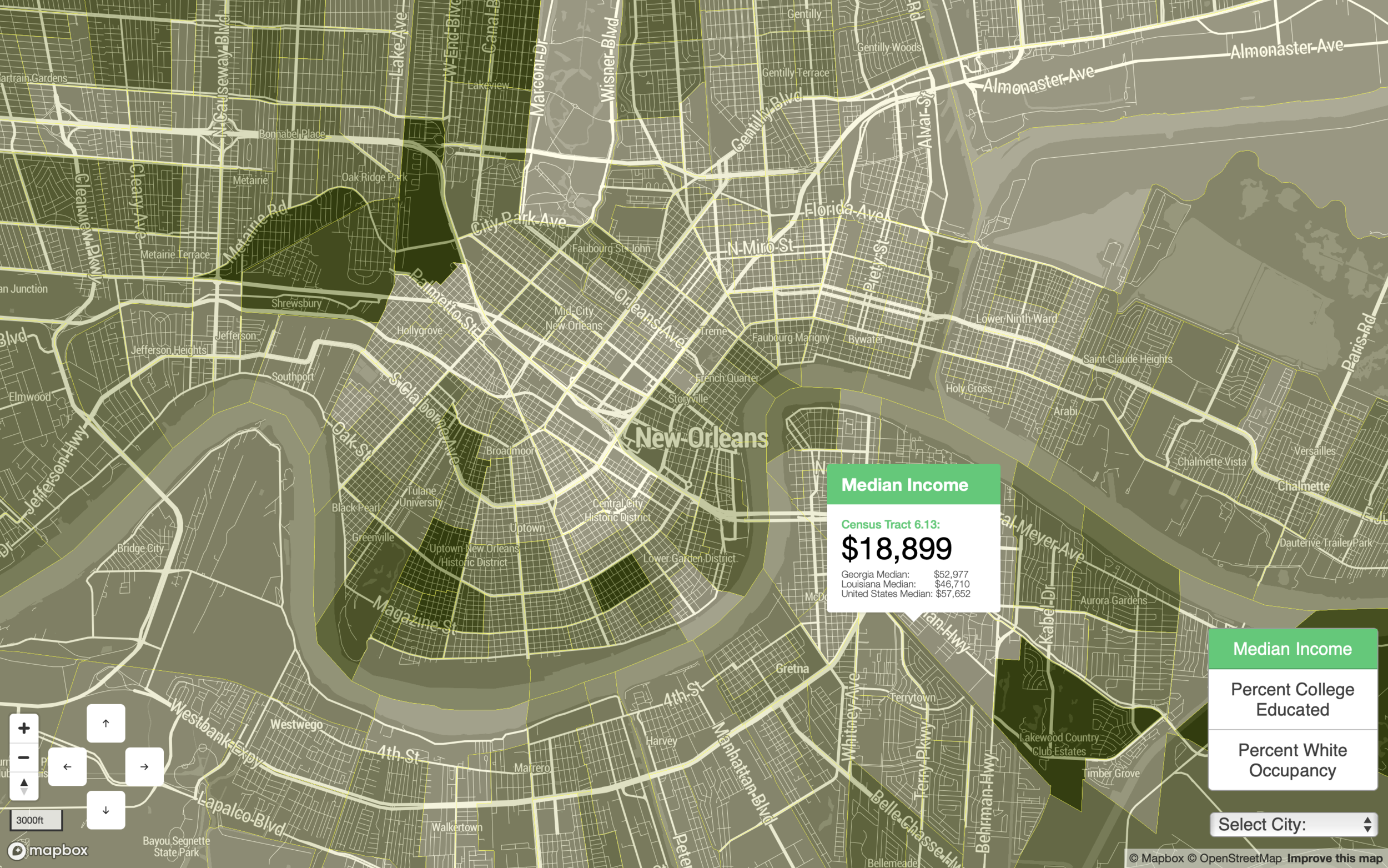
WHAT IS THE MAP SPOT?
In 2018, Jer Thorp of New York University’s ITP and Georgia Tech Assistant Professor of Digital Media, Yanni Loukissas created the Atlanta Map Room, a multimedia installation of computer, tablets, projection and paper that allows users to create large scale maps of Atlanta in an exploration of civic data and gentrification.
I built the MapSpot as a mobile and portable equivalent of the Map Room so that similar experiences could be hosted at conferences and events in Savannah and New Orleans.
The MapSpot consists of portable projector and a laptop running the MapSpot program which displays a map with toggle-able data sets.
RESEARCH AND CONCEPTUALIZATION

In order to understand what was necessary of the MapSpot, I observed use of the Atlanta Map Room. I took note of what users found confusing, what was meaningful for them, the role of the facilitator, and how the mechanics of the machines installation worked. By analyzing these findings, I distilled the experience down to its most valuable parts to preserve in the mobile equivalent and took note of opportunity for UI improvements.
IMPLEMENTATION

In my implementation of the MapSpot, I made the following improvements:
New Data Sets
I added two new data sets, Percent White Occupancy and College Educated. The choice of these data types came directly from the students I interviewed and what information they felt were the best indicators for understanding community change and gentrification.
Layering of Data
Data types overlapped in first iteration of the MapRoom and were all displayed in the same color. I had the idea of sending notification when new layer was added but found the repeated dialogues and alerts distracted from the experience and appeared distorted when on the table. In end, I decided to make each layer mutually exclusive and different colors. At first, I wondered if value was being lost by not allowing the user to see two data layers projected at once; however what I found in testing was that it actually further engaged users. Because they couldn’t have two layers projected at once, they would project one, in some way creatively record the first layer through drawings or markings on the map, and then apply the second. Thus by limiting the functionality of the tool, I was able to better engage the audience.
REFLECTIONS A YEAR LATER
Check out a recent video where Prof Loukissas, Jer Thorp, Chris Polack, and I, discuss the MapSpot and map making with Prof. Scott Knowles in relation to COVID-19.
GALLERY